Olivier's La Boulangerie
Brand Identity + Packaging Design + Marketing Strategy
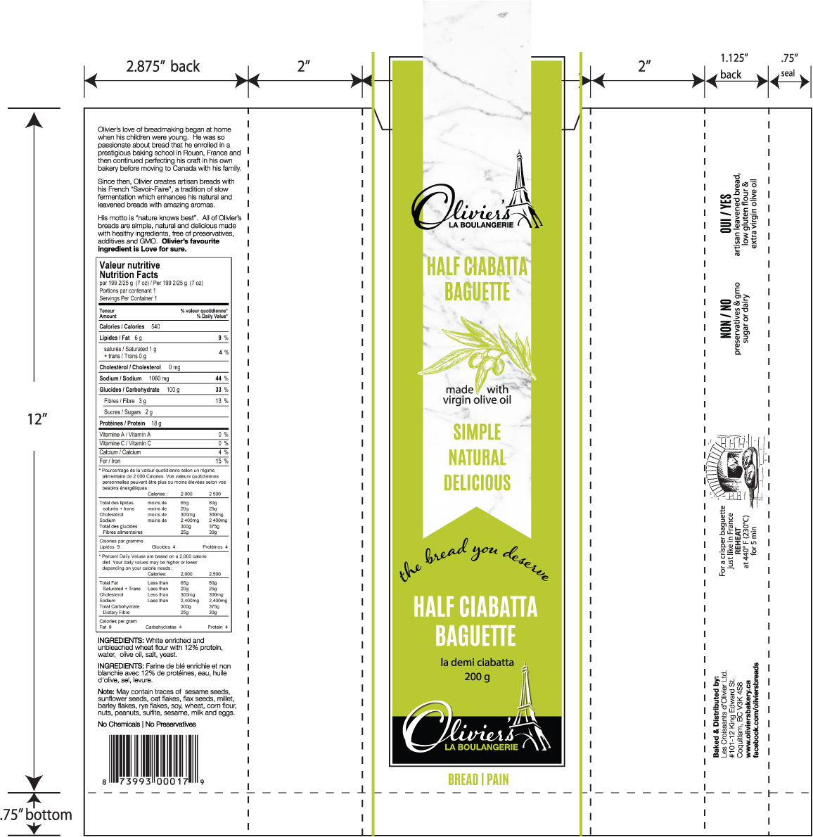
When Olivier’s Breads approached me in 2017 to redesign their packaging, they were ready for a transformation. With their recent manufacturing expansion, they needed a refreshed identity to build brand awareness and expand their presence in the retail marketplace.
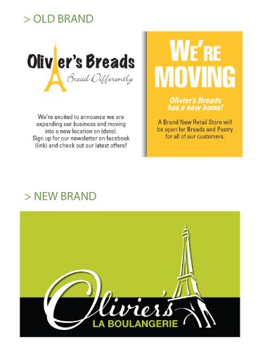
Through a series of strategic discovery sessions, we uncovered their core values and refined their brand story—bringing their French heritage to the forefront. The business was renamed Olivier’s La Boulangerie — a subtle yet powerful evolution that reflected elegance, authenticity, and craft.
Their products needed to speak for themselves: simple, honest, and environmentally conscious. Olivier and Valérie were passionate about sustainability and tradition — no processed ingredients, just real food made with integrity. A return to basics. A deep respect for the planet.
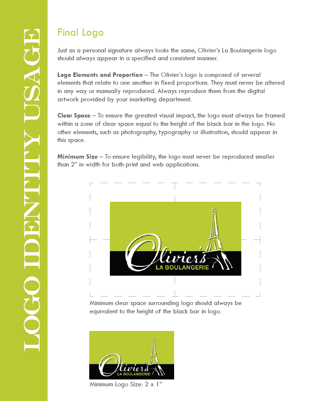
We created a custom wordmark for Olivier to evoke an artisan feel and elevate the visual tone of the brand.
I wanted the identity to capture three key elements:
• Growth — symbolized through a vibrant, modern green
• Warmth — inspired by golden sunlight
• Heritage — expressed through bold, stylized typography grounded in European tradition European tradition
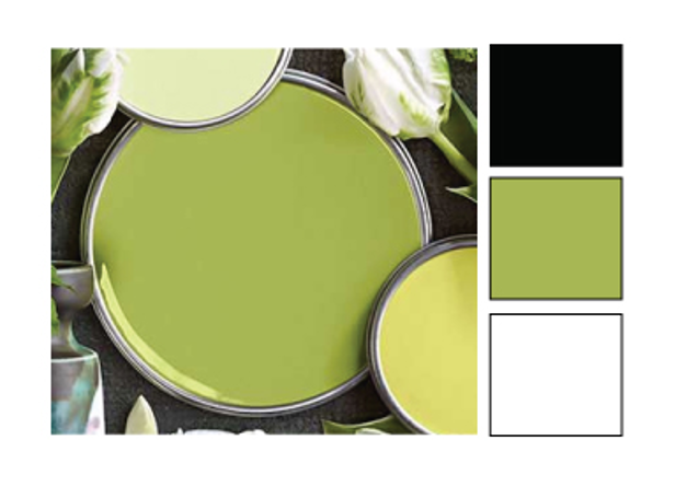
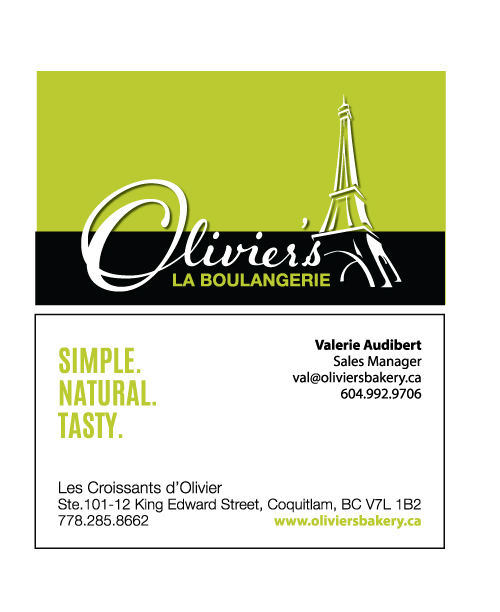
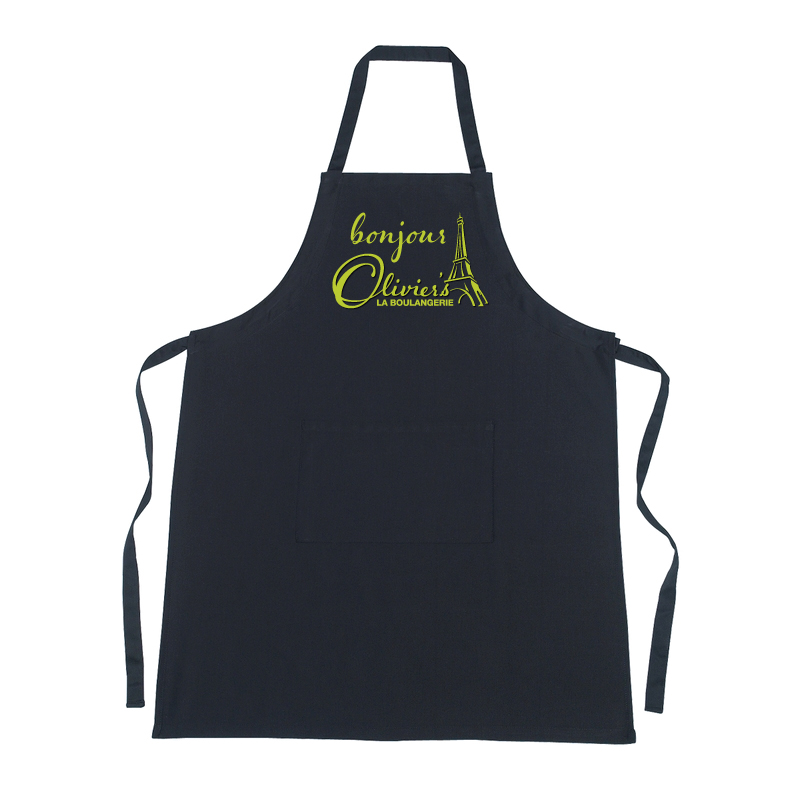
The result: chartreuse — a bold yellow-green paired with black and white. It was fresh, modern, and unmistakable on the shelf. A brand that felt elevated yet grounded, rooted in culture and craft.
This is the kind of work I love most:
Where design meets meaning. Where story meets strategy and where something as simple as a loaf of bread becomes a vessel for legacy, beauty, and growth.
If you haven’t been to their manufacturing retail outlet in Coquitlam, you’re missing out!

